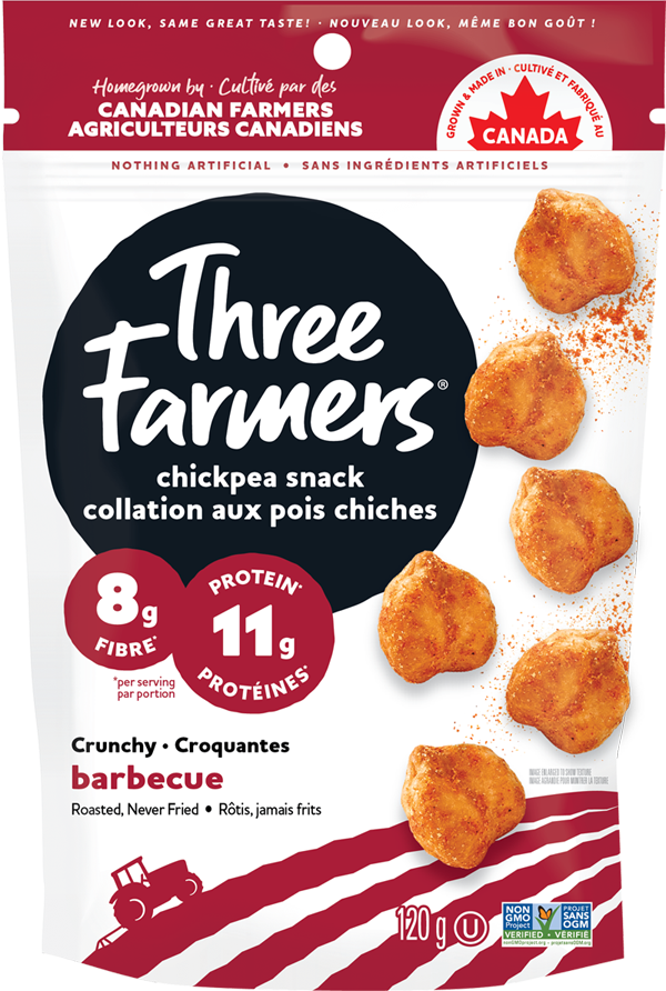
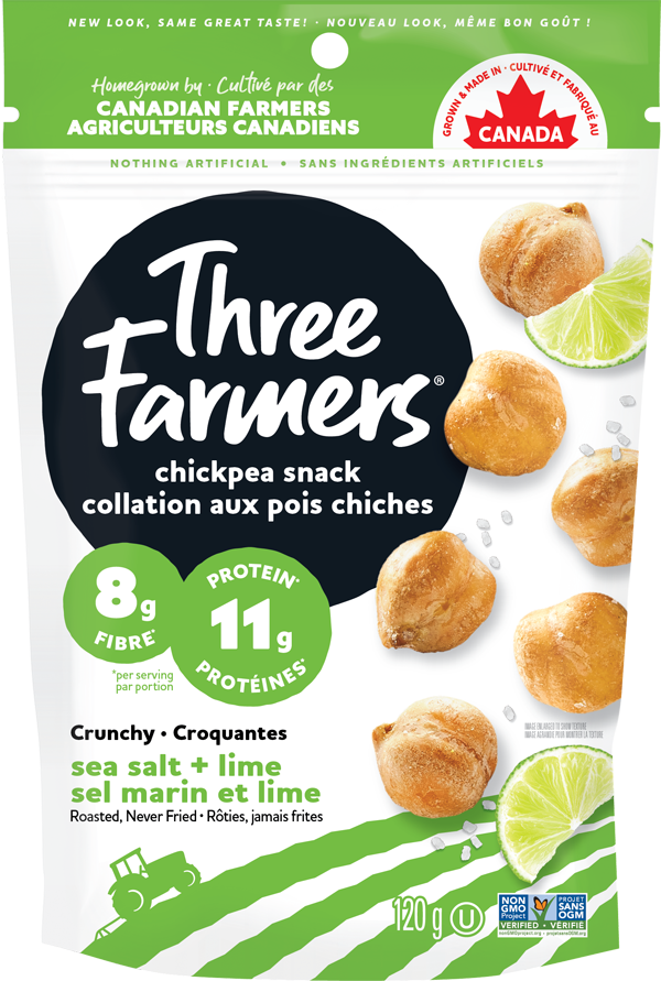
Three Farmers
Disrupting the snack category with refreshed BFY packaging
- brand strategy
- copywriting
- visual strategy
- brand identity
- packaging design
- web design
- brand guidelines
- POS & merchandising
- photography & art direction
- production artwork
overview
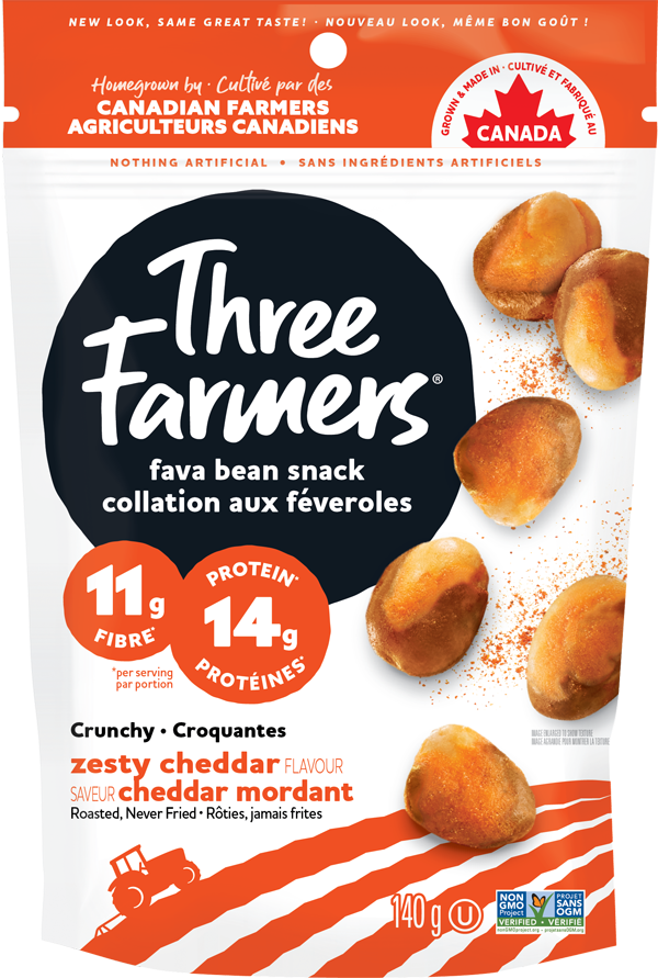
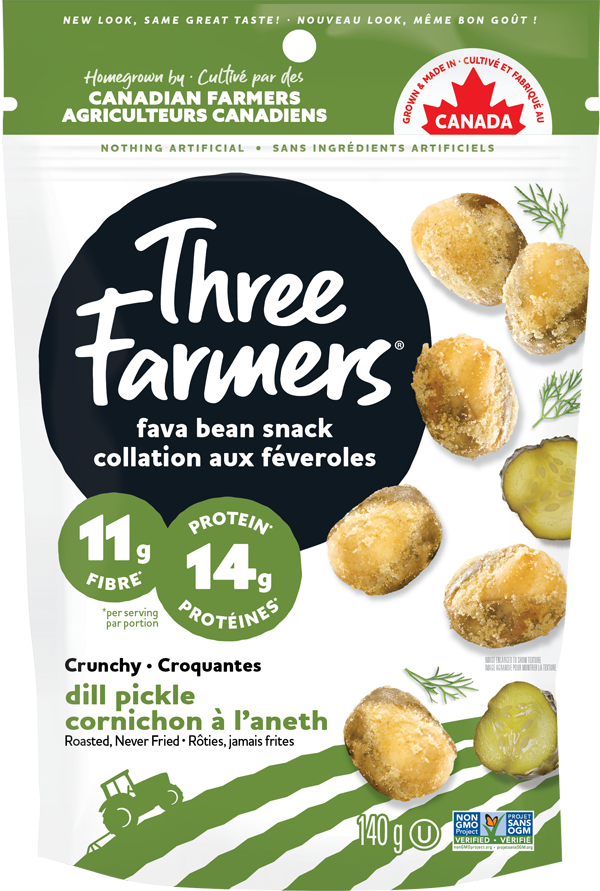
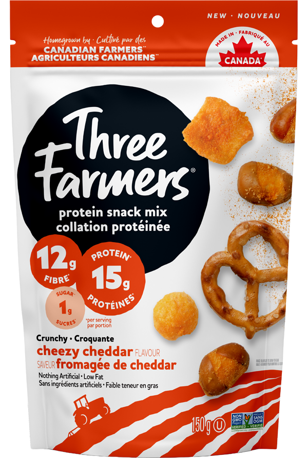
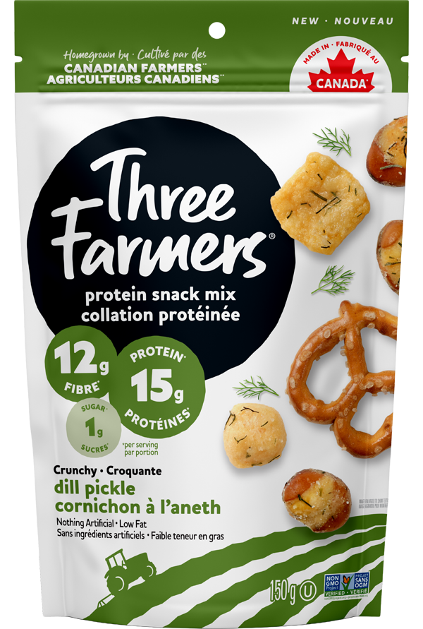
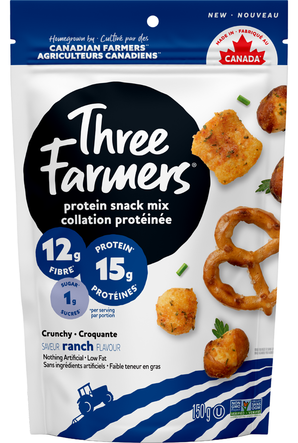
With a strong brand story and unique product line of healthy snack options, the new identity and packaging for Three Farmers speaks to consumers’ hearts, minds and taste buds.
challenge
Three Farmers was looking to redefine the snacking category and highlight the crunch, flavor and nutritional benefits of their better- for-you products. The refreshed brand identity, packaging, and marketing collateral needed to attract health-conscious consumers through a modern and ownable design system that stayed true to the brand’s foundation.
solution
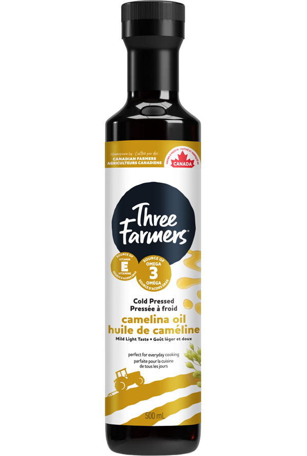
The brand’s new identity and packaging design started with a refresh of their positioning to ensure that not only is Three Farmers viewed as a healthy and filling snacking alternative, but they are also known for flavor, crunch and overall taste appeal.
Through this lens, we developed flavor forward packaging that celebrates product ingredients and benefits through mouth-watering photography, prominent BFY claims and bold colors. Meanwhile, an updated logo and illustrated nod to the farmers at the heart of the brand create a familiar and approachable refresh that stands out on shelf.
results
To validate the refreshed brand identity and packaging design, it was important to test design concepts among consumers. Through the research that was conducted, we found that the updated designs have increased purchase intent and likability against the competition. This positive feedback has been furthered now that the brand identity and packaging have been revealed to the public. The brand is anticipating 30% velocity increase with the new look on shelf, and e-commerce sales are currently growing 15% month over month.
velocity increase on the shelf
%
monthly e-commerce growth
%


Three Farmers Foods