Details in the Design: The Better Chocolate Challenges the Status Quo

For most food product startups, the first hurdle to cross isn't the consumer but the store buyer. It's easy to forget, but before a food product can entice consumers, it has first to catch the eye of the retailer. Entrepreneurs launching products, particularly those that break conventional food categories, need to realize that an engaging package design is the key to capturing a retailer's interest.
Take, for instance, Suzie Yorke's chocolate venture. The initial packaging designs prepared by another agency were not delivering on key metrics. Our team stepped in, setting the brand framework, exploring visual territories, and eventually giving life to the desired package design.
In Suzie’s words,
I quickly realized that the packaging of our Functional Snacks Chocolates was good but not strong enough.
For lots of reasons I knew we could do better.
I had just re-connected with Anne Marie Pagliacci, the CEO of invōk brands whom I worked with for years, and value and trust so much.
She said, “You can do better- let us help!”
We had to try.
Well, we moved fast with great creative and designers. We met in person; our Packaging Brief was clear and tight, and the team was energized.” [1]
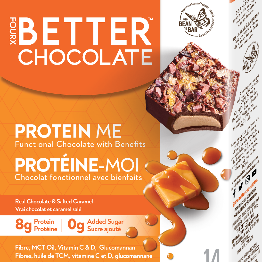
Suzie wanted the product to stand out and highlight its unique benefits. It's not just chocolate; it's a delightful, guilt-free snack break. The design challenge was to make it resonate with appetite appeal and make it evident that despite being a healthier option, there's no compromise on taste.
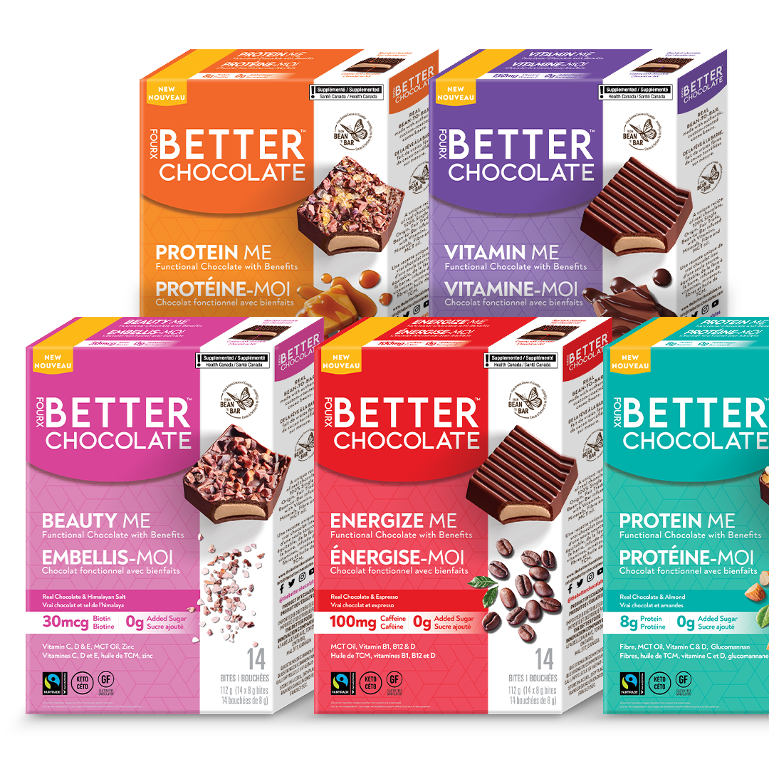
Challenging conventional design norms, our designer questioned whether logos always needed to be the same color everywhere it was presented. Isn't consistency also about structure and hierarchy? Considering each SKU has a different function, the design journey took a route where each product's essence defined its color palette.
The Invok design was inspired by collective input from designers Devon Luxmore, Carolina Blomberg, and Becky Caunce. The client's inclusive mindset meant the entire team contributed, leading to a design that embodied everyone's vision.
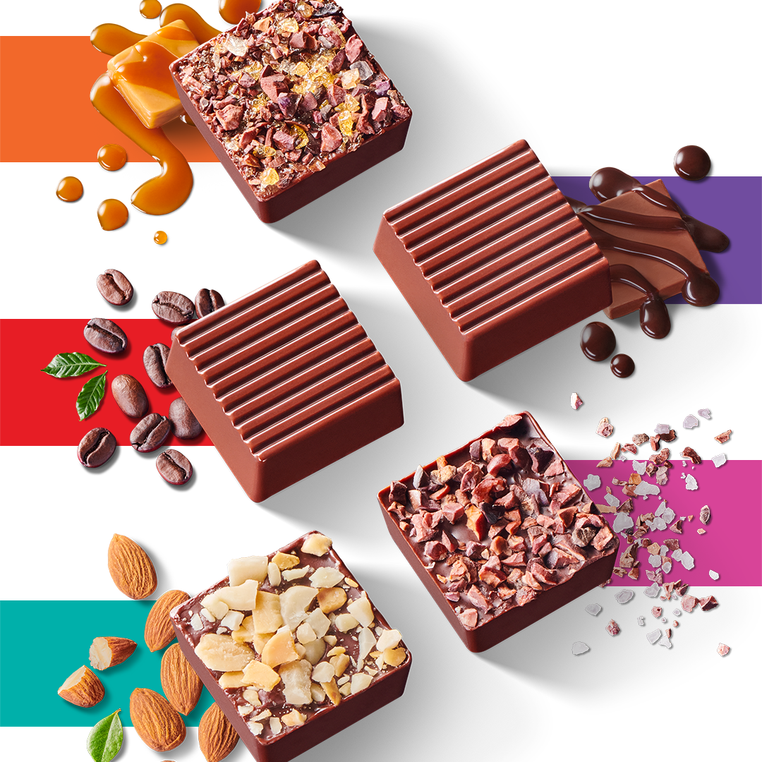
A product that's 'better for you' shouldn't look bland. Contrary to the belief that sugar-free might equate to tasteless, our vibrant colors, from the beauty-resonating pink to the salted caramel hue of orange, vouched for its flavorful appeal. The colors brought the product to life and were thoughtfully chosen; green for the almond (not the sharp lime), pink for its salt ingredient, and the rest in harmony, appealing to the palate.
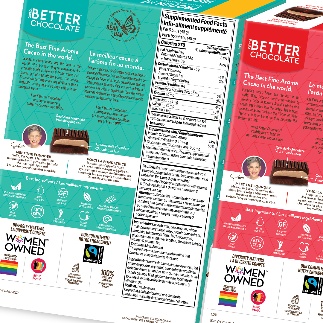
We even proposed fresh photography to represent the ingredients authentically. Meticulous use of space showcased the logo of the fair-trade "beans to bar" cocoa butterfly. With numerous product claims, the challenge was to ensure a clear layout. The design focused on straightforward navigation and shopability. The differentiation was holistic – not just the logo or color, but the entire package.
In the vast world of healthy snacks, 'The Better Chocolate' truly stands out in flavor and design.