RoC Skincare
Creating a cohesive consumer experience across all touchpoints through ongoing brand stewardship
- visual strategy
- brand design
- brand architecture
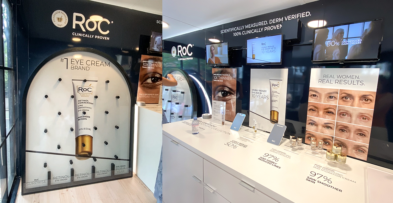
- retail display & pos
- digital & social
- production artwork
- brand guidelines
- brand stewardship
overview
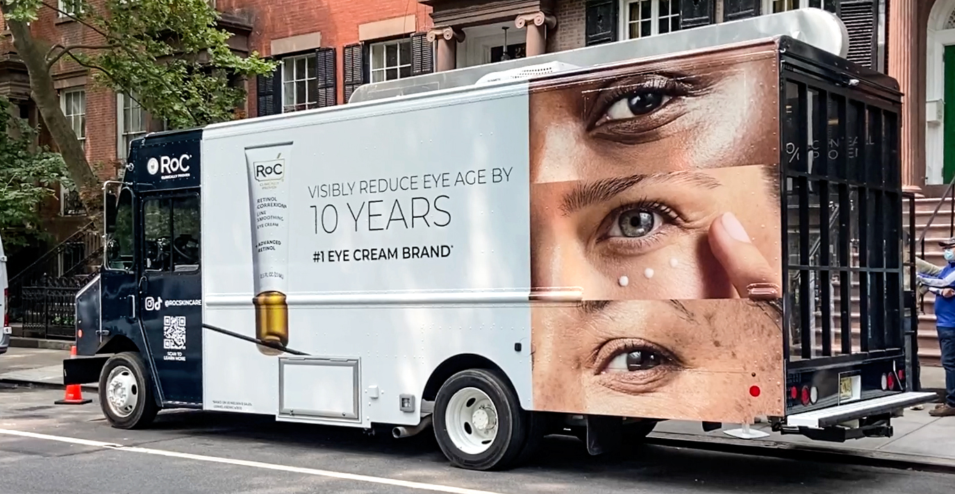
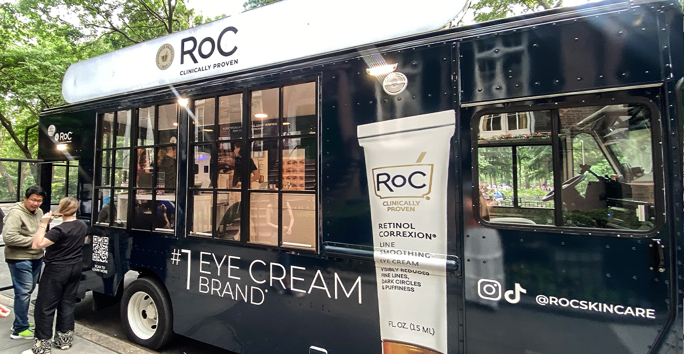
What started as a brand refresh quickly turned into Invok becoming RoC Skincares’ global agency of record, helping the iconic brand remain relevant through ongoing print, packaging, in-store, out-of-home and online brand stewardship.
challenge
Founded in 1957, RoC Skincare has established itself as a leader in the beauty industry with their clinically proven, efficacious products. However, the brand recognized that they needed to evolve in order to grow in the rapidly changing beauty industry. This meant partnering with an agency that could manage strategy, creative, and a high volume of projects to ensure all consumer touchpoints were consistent, on brand and engaging.
solution
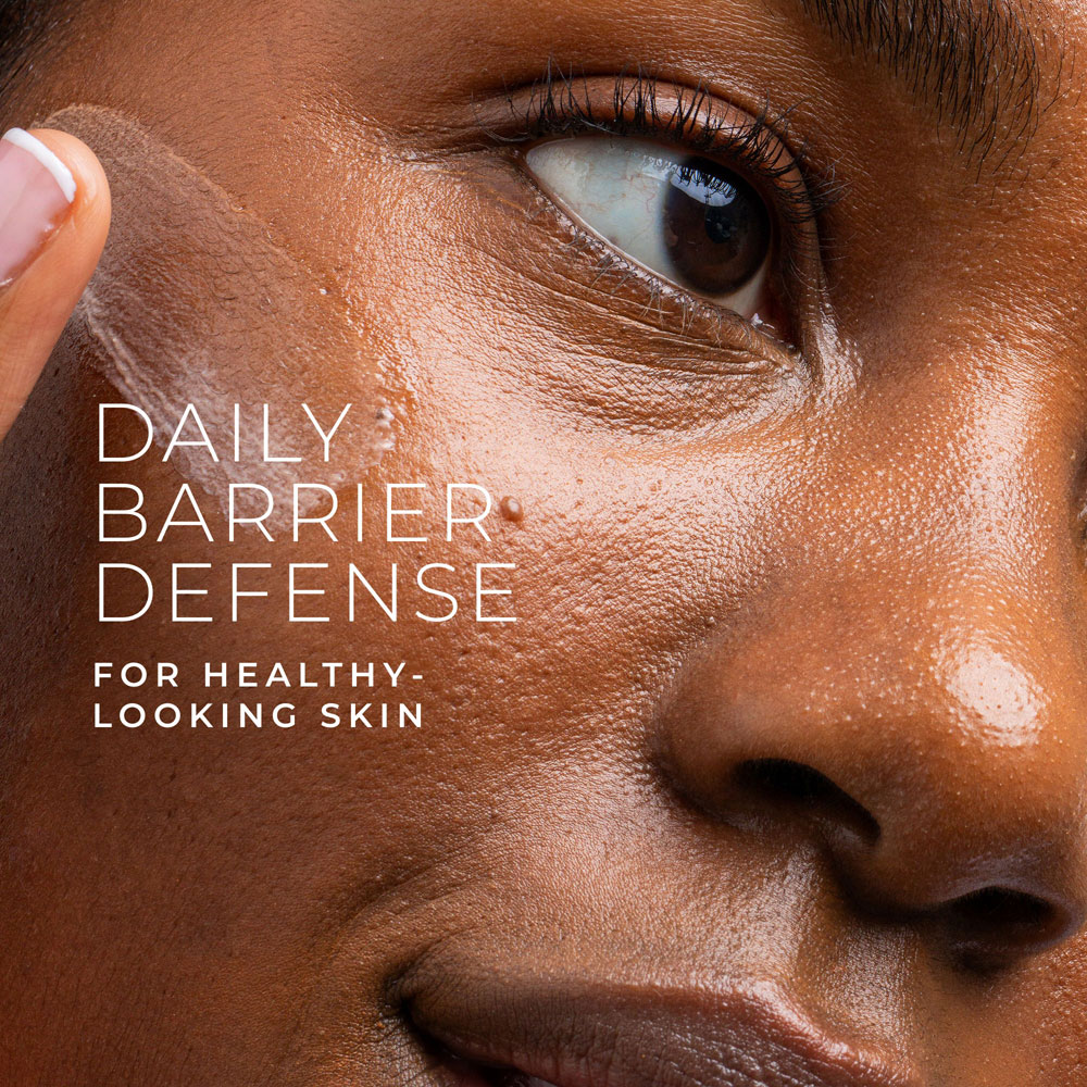
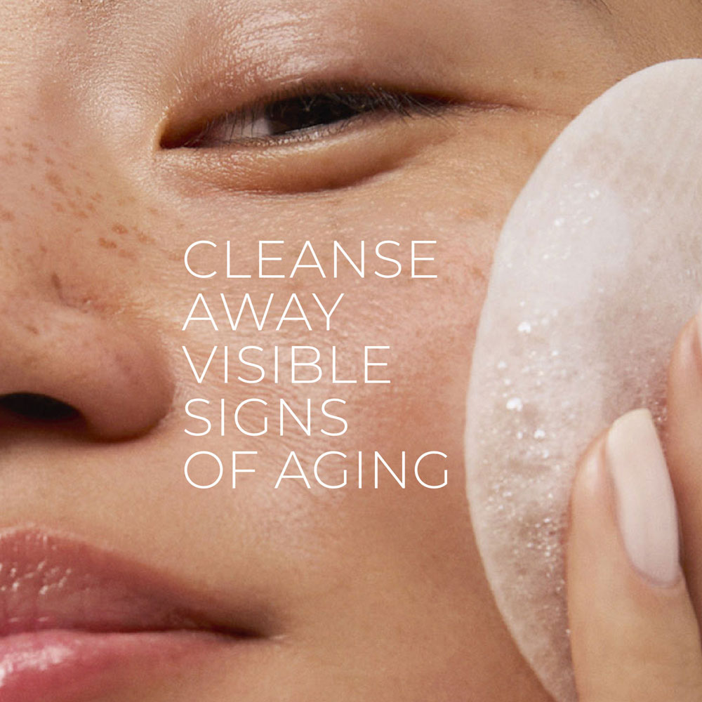
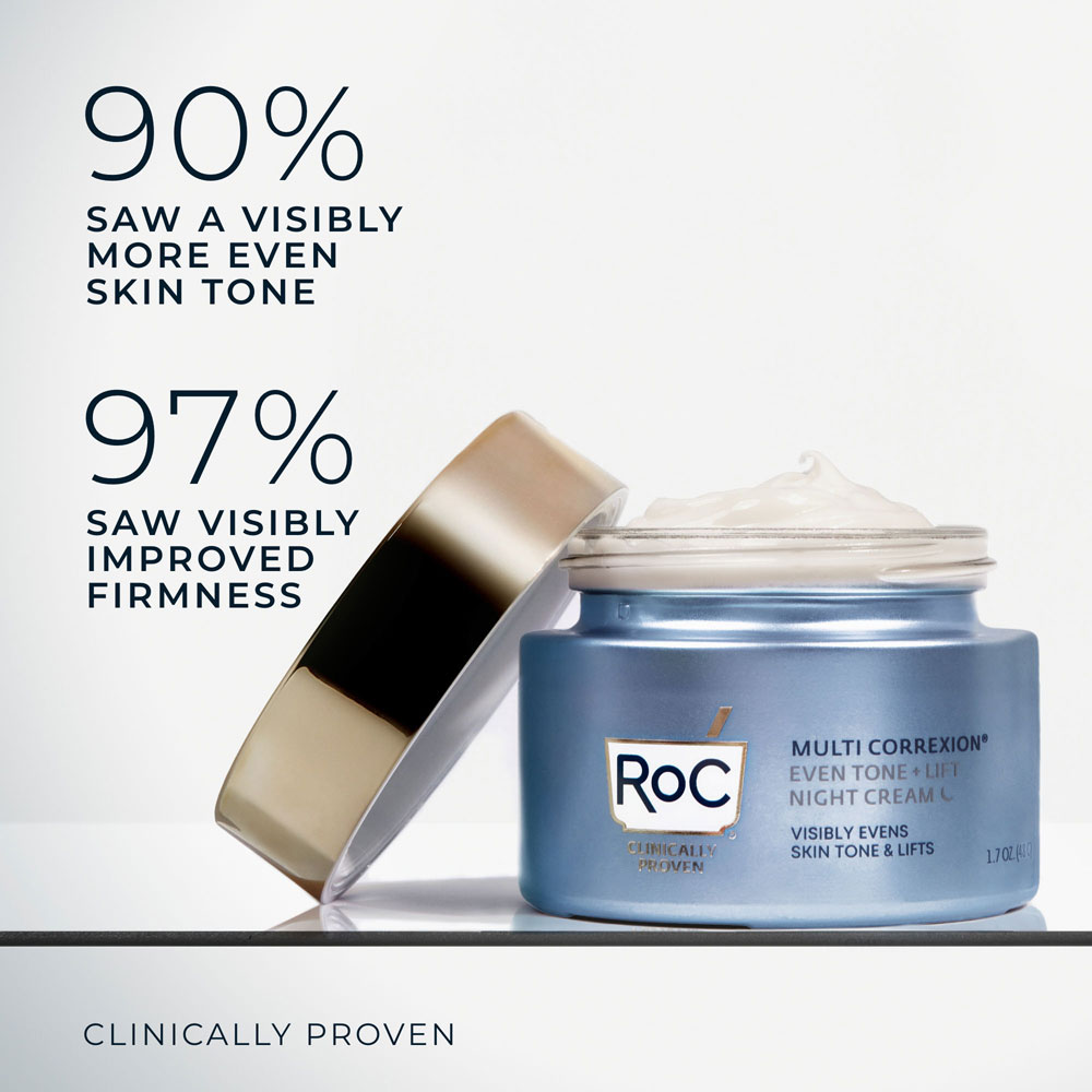
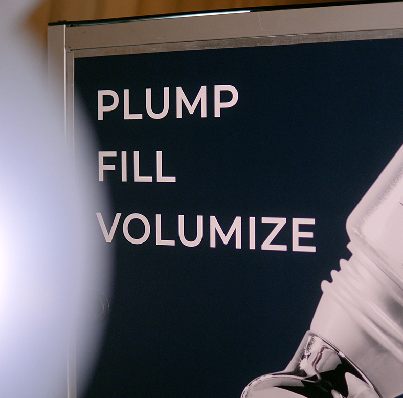
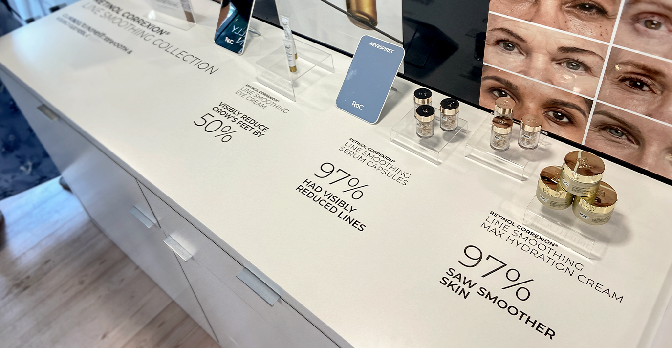
Wanting to lean into the clinically-proven attributes of RoC products with a modern yet scientific aesthetic, the overall goal of our work with RoC has been to build trust and confidence among consumers by showcasing its pharmacy heritage, commitment to state-of-the-art science, and clinically proven results.
From the updated logo that retains RoC’s prestige and history, to the use of brand blocking, white space, soft colors, premium finishes and simple language, there is an approachable authority to the look and feel of the RoC Skincare brand identity that can be flexed for different products, markets and mediums.
Results
Since our partnership began in 2017, RoC has experienced an impressive 150% growth in sales. During that time period, we have worked on over 900 projects with the skincare brand, designing some 3,500 assets (and counting) – growing RoC from 15 SKUs to over 90. As their chief brand steward, we also have on-site staff who work at the RoC office to ensure seamlessness and collaboration.
business growth since
partnership began
%
design assets created
(and counting)
+
We then took it a step further to ensure the logo presents well across all brand touch points, while maintaining a clinical and trusted feel.
Our goal was to modernize and simplify the logo, while retaining core elements and reinforcing that RoC products are clinically proven.
The original RoC logo featured a mortar and pestle, and colours that positioned the brand as the gold standard in scientific skincare.
The latest updates bring an elevated sense of modernity and sophistication to the brand through a streamlined approach to design and communication.
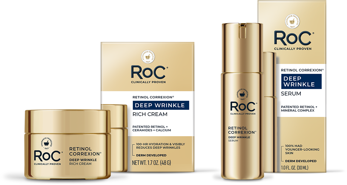
Our first evolution of the RoC packaging saw a simplified packaging architecture that felt less busy and aided in consumer understanding.
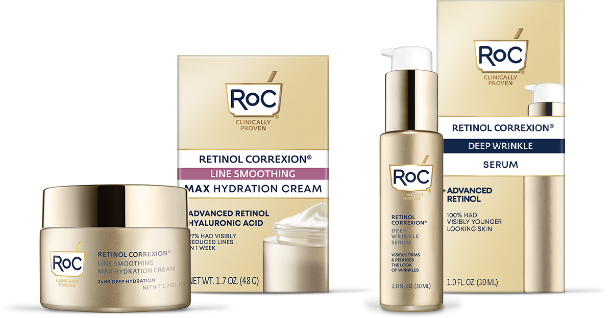
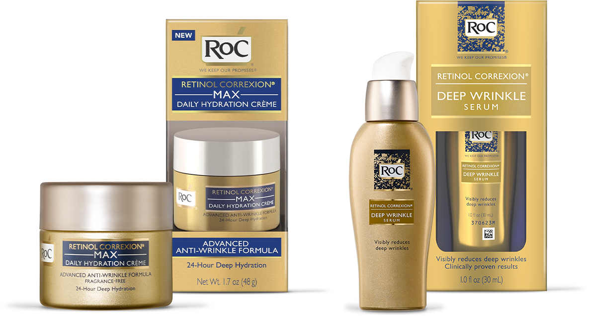
The brand packaging that we inherited was heavy on the gold, with product format and attributes getting significant prominence.

RoC Skincare