
details in the design: down home pantry

You'd need a thousand words, at least, to explain who you are. Same with a brand. And it's probably TL;DR anyway. That's why in branding, we use the shorthand of graphic design instead.
Welcome to our Details in the Design series, where we explore how our graphic design work brings a brand identity to life.
A package of warmth and comfort
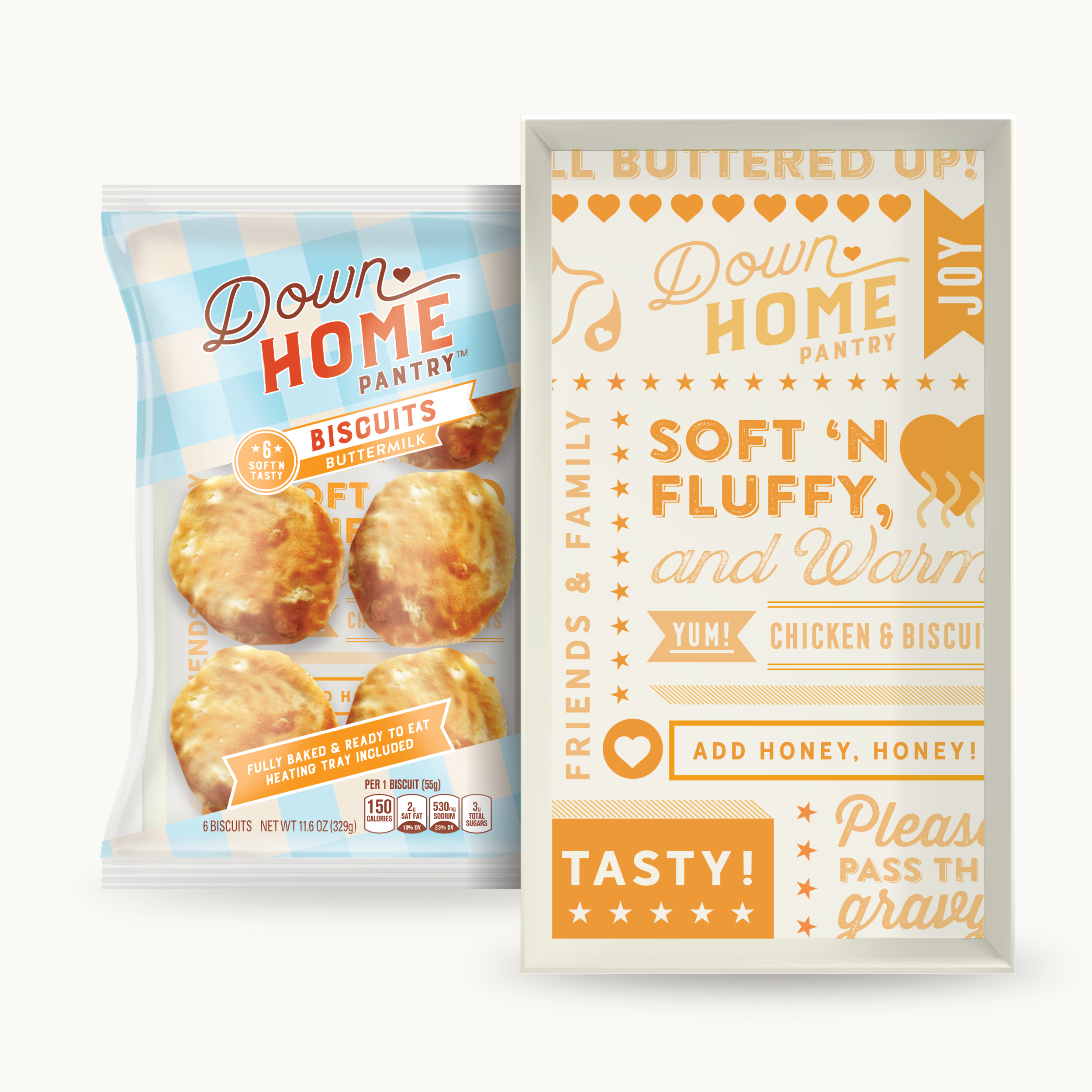
Unto itself, the humble biscuit is a package of warmth and comfort. Enjoyed daily and special occasions, it is an iconic Southern food that evokes kinship. The thought of a biscuit, fresh from the oven and made with love, is fuel for good memories. Inspired by all that the biscuit represents in Southern family and food culture, we designed a nostalgic and sensory-driven package for Down Home Pantry ready-to-serve fresh biscuits.
Anticipatory Unboxing
In the packaging, we aimed to design an anticipatory unboxing experience for food. The warm color palette of blues and oranges adds coziness to each layer of the packaging structure and tells the story of gathering over food. As you put the biscuits in your cart, you think of preparing them and calling together the family to eat.
We designed the whole package to take on the idea of a place setting while showing just enough product for taste appeal. From the outer layer with its picnic-tablecloth gingham-inspired pattern, you can peek through the warm-and-serve tray and see more brand personality.
To design the inner packaging, the tray, we took inspiration from the window signs, interior décor, and menus of bakeries and bakeshops, delis, and diners. The package invites you to eat with phrases like "Yum," "Friends," "Serve with honey," and "Soft and fluffy." The graphics (stars, hearts, steam, and ribbons) are fun, warm, and playful. Mealtimes are social, after all, and the biscuits are ready to join in.
Yum.