details in the design: roc skincare

You'd need a thousand words, at least, to explain who you are. Same with a brand. And it's probably TL;DR anyway. That's why in branding, we use the shorthand of graphic design instead.
Welcome to our Details in the Design series, where we explore how our graphic design work brings a brand identity to life.
In 2018, ROC asked us to revitalize its brand and packaging. We aimed to maintain yet refresh RoC's iconic character and highlight its pharmacy heritage, commitment to state-of-the-art science, and clinically proven results.
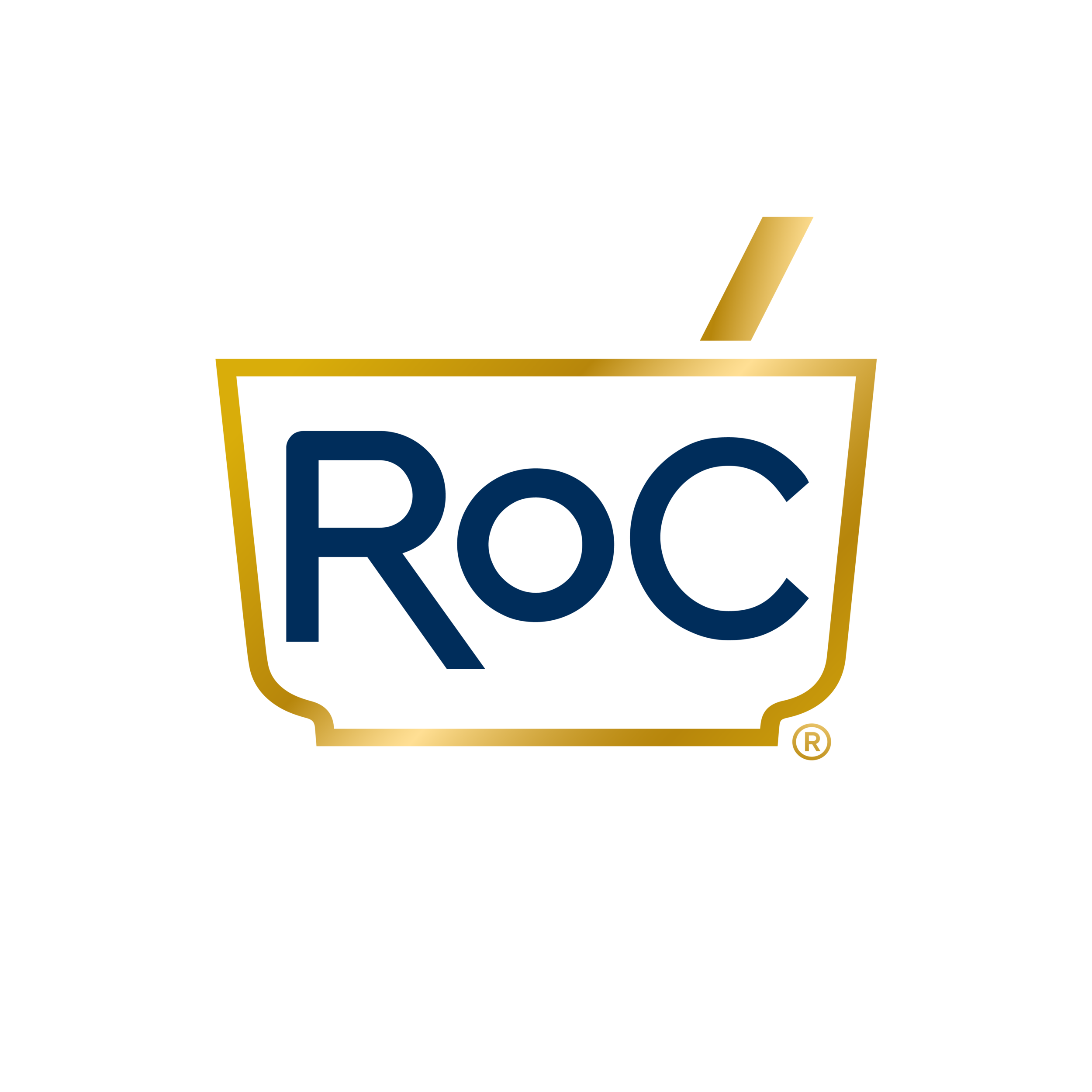
Our design pays homage to history and refines it, nodding back to its clinical, formulary roots. For example, the pharmacist's tool was a mortar and pestle, and that image continues to evoke the precision used in all RoC's formulations.
To appeal to today's consumer, we incorporated the current beauty culture and aesthetic to create a purposefully contemporary, elevated, and evolved impression. We streamlined the look so that it still nods back to its origins but looks better on your vanity table. We gave it a premium look by reducing the copy and ensuring all design elements work together. On an RoC package, consumers can easily see the benefit of the product.
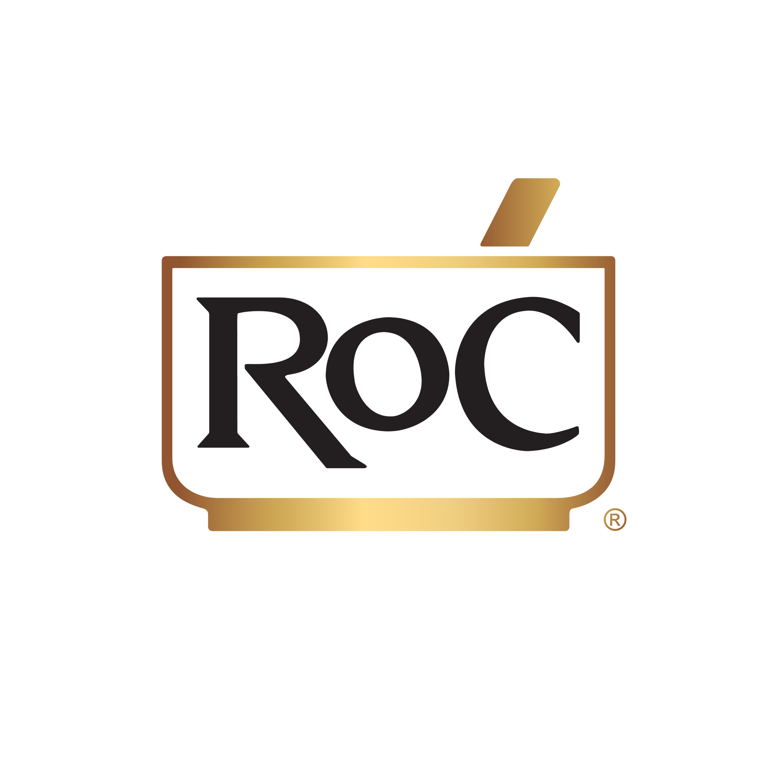
We kept but updated the RoC logo and the gold, which is present on every single pack. The logo is a mortar and pestle, which historically symbolized pharmacy, and we kept that as it is true to the brand's origin. We chose the perfect champagne gold to replace the original mustard color.
In the end, we polished up this iconic skincare brand to powerfully communicate its rich heritage and French pharmacy roots.