The new Johnson & Johnson logo is a good idea.
Johnson & Johnson is not in the nostalgia business. Every day, scientists, doctors and innovators search for a cure. Its work, while certainly depending on historical precedent, is all about the future. It does not thrive on blind adulation of the past – and neither should its logo.
We at Invok are designers, not biologists or physicians, but it seems to us that science is hard and drug development is all about taking risks which may – or may not – lead to miracle discoveries. This column supports one company’s willingness to take risks in the global evolution of its iconic brand identity.
There are two reasons why the evolution of this logo makes sense.
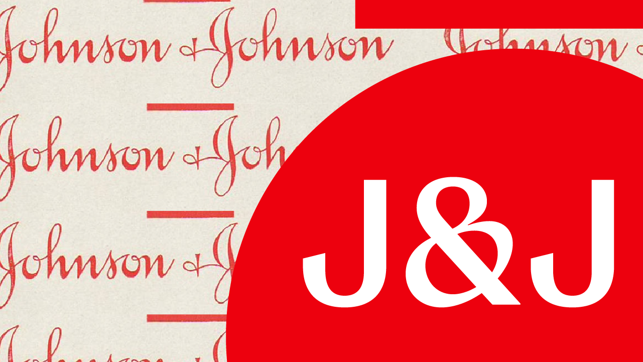
In the last couple of weeks, it's been fascinating watching the design community react to the recent redesign of the Johnson & Johnson logo. Remember, this identity was originally designed when the company was founded in the 1880s. We think the new logo design makes sense for two reasons.
Reason #1 – It supports the new pharmaceutical company
The first reason stems from Invok’s long-standing connection to Johnson & Johnson. Over 25 years ago, when we started our firm, we were extraordinarily grateful to have Johnson & Johnson as one of our first three clients. Since then, J&J has trusted us to evolve the visual equity of iconic brands for Aveeno, Band-Aid, First Aid and most recently, Johnson’s Baby. As each of these global brands incorporated the Johnson & Johnson logo with its red script letterforms, we are very familiar with its usage, characteristics, and consumer equity.
Given our long connection to Johnson & Johnson, you might think that we are appalled by the change. But we actually wholeheartedly support it.
The identity fits the newly established company profile as a stand-alone pharmaceutical company, separate from the consumer products company that is now called Kenvue. To use design language, the typography has a professional, clinical and trustworthy appearance. These are essential communications points for a drug research company. And it is an improvement, from a legibility standpoint, because children haven’t been taught cursive writing since 2010.
In addition, the new logo’s visual equity supports and defines a new kind of 21st-century “soul” for the corporation.
There are those who feel an electric car lacks “soul.” They believe a real car must reflect the traditional properties of an internal combustion engine - be loud and aggressive and have the noise and aggression clearly associated with it. We understand those feelings but suggest that an electric car exudes the soul of the 21st century, while a gasoline-powered car exudes the fading remnants of the early 20th. This same analogy can be said for the new Johnson & Johnson identity. It radiates the soul of the 21st century and is not a relic of the 19th.
Reason #2 – It reflects the brand’s future, not the past.
The second reason for my fascination with this J&J redesign is I teach about historic brands and design equities and how they play in developing our consumer culture. My course in the Masters in Branding program at the School of Visual Arts includes lessons on many brands that were born during the 19th century when our current retail marketplace was being born.
Johnson & Johnson is not Coca-Cola.
Two of the historic brands we study in my course are Johnson & Johnson and Coca-Cola. They were founded around the same time and have a unique script brand identity, so the two brands have been compared in recent discussions about J&J’s’ new logo. These discussions have focused on what horrors would ensue if Coca-Cola redesigned its logo as well. And we agree they would. Very few companies have been as brilliant as Coca-Cola in understanding exactly who they are and how to exploit their design equities. But it is a soft drink company, not a drug company, and so the two brands’ identities should represent the critical difference in consumer expectations about two distinctly different industries.
So, in conclusion, science is hard. It’s about taking risks. It is also about envisioning hope for the future, not nostalgia. It is about life, not simply whether a particular type font from the 19th century should continue to represent a contemporary pharmaceutical brand. So, folks should just chill. I, for one, admire the vision and optimism that the new Johnson & Johnson identity represents.